Charts and Widgets
As
test_user1create a new map and add thene_50m_admin_0_countrieslayer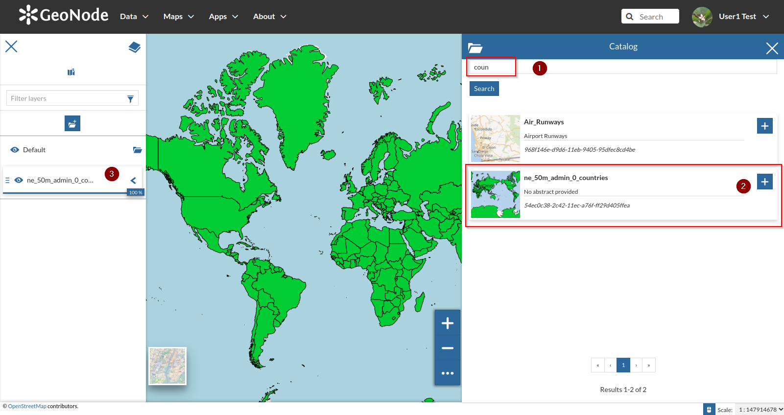
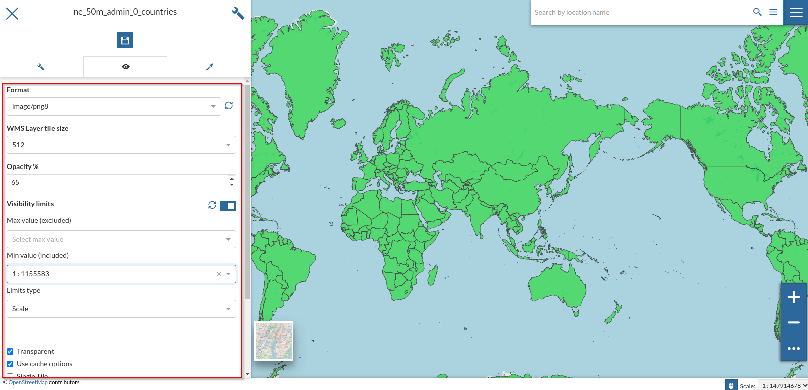
Let’s tweak a bit some settings as we learn from the previous section
Let’s also change the style to the
CSSone we created on the previous chapters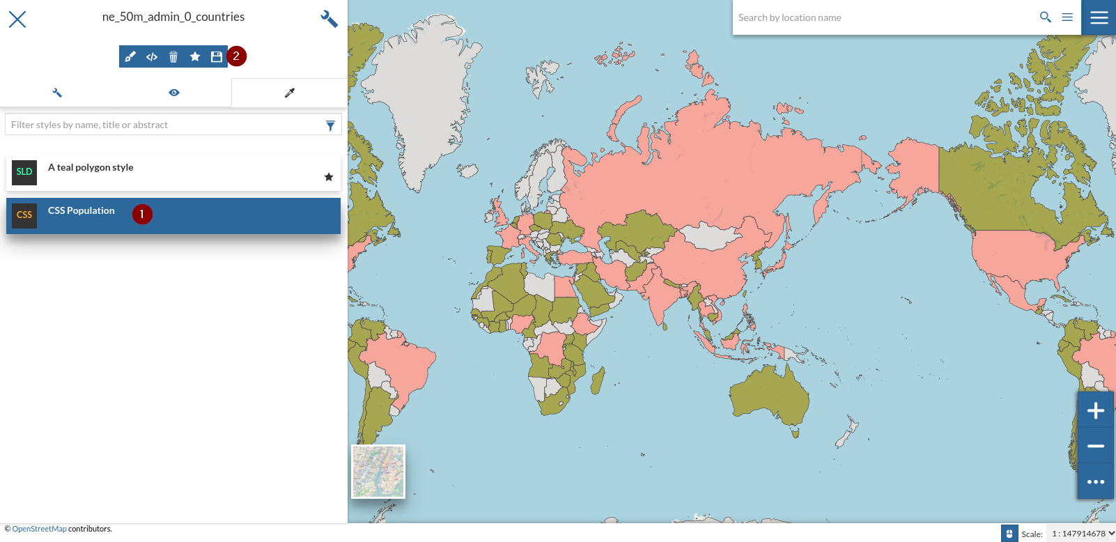
Open the
Charts and Widgetwindow and selectTable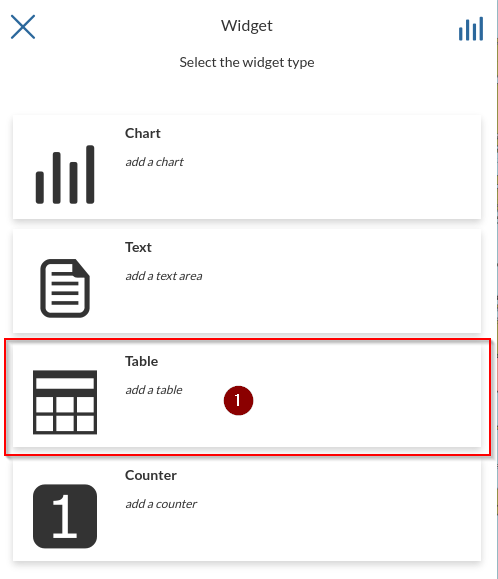
Select only the attrbutes
NAMEandISO3and click onNexticon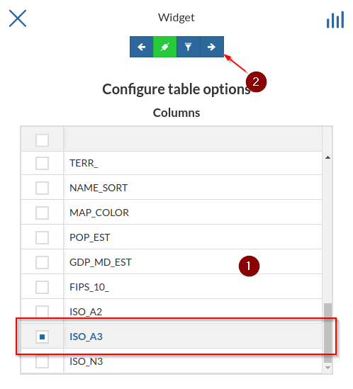
Provide some
TitleandDescriptionandSave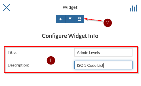
Resize and move the widget where you want on the map; also notice that its contents change accordingly to the geometries present on the viewport
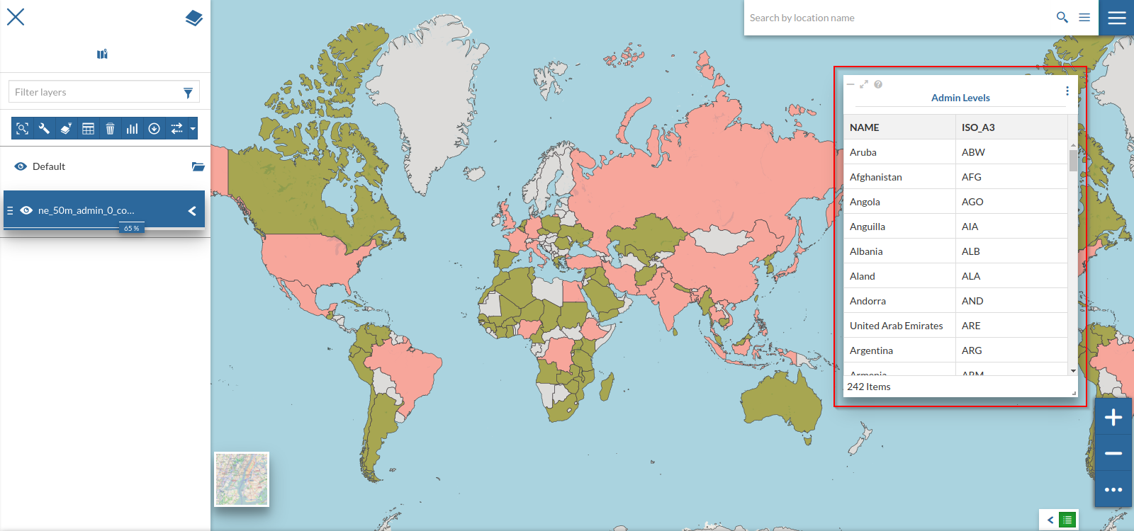
To change its contents and make them fixed, despite the zoom level, edit the widget again and uncheck the
Chainicon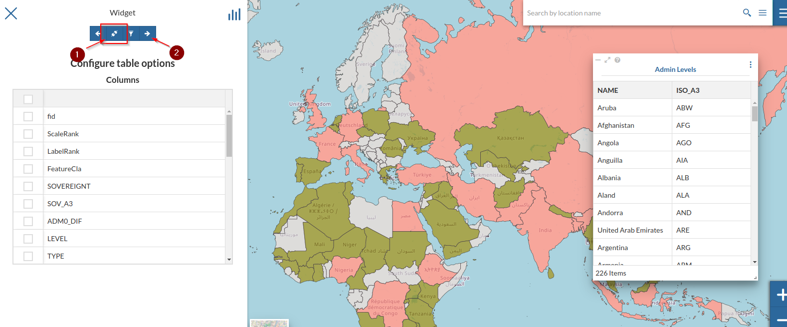
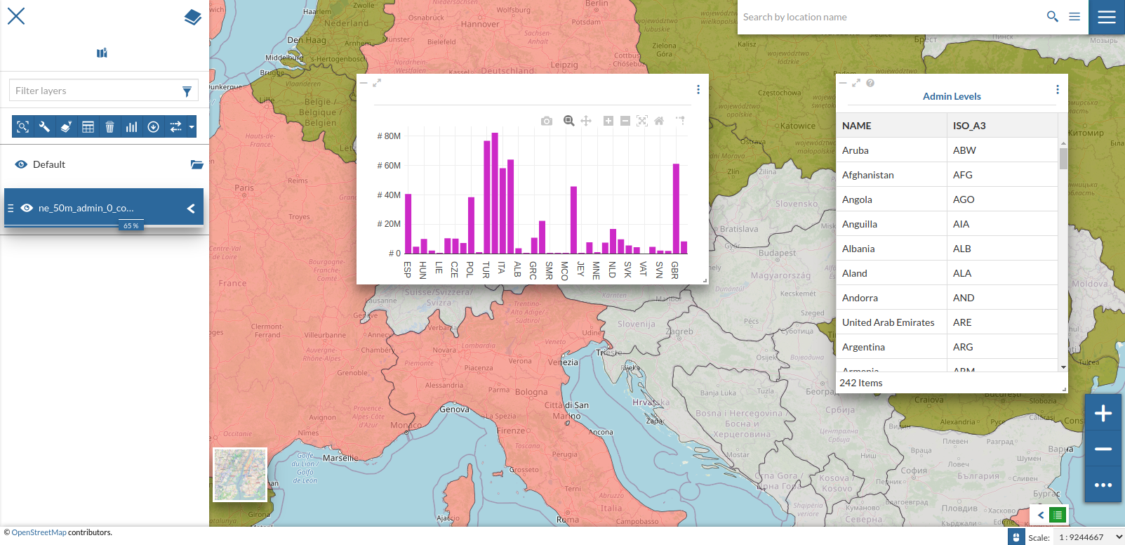
Let’s add a
Chartwidget to the map; repeat the steps at point 1 but selectingChart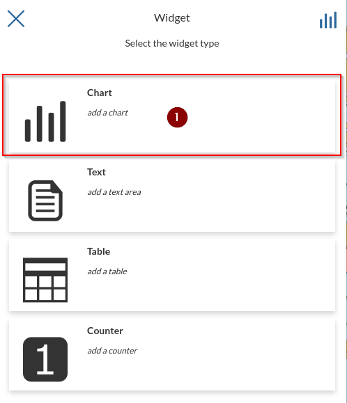
Select
ISO3asX Axis,POP_ESTasY Axis,MAXasOperationand, optionally, change the color of the chart; notice the preview changing accordingly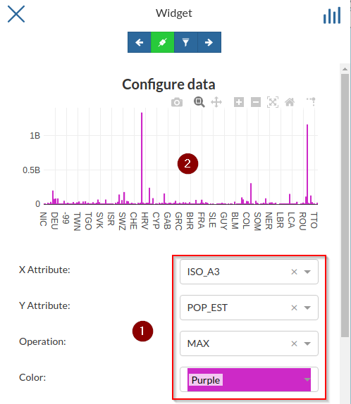
Open the
Advanced Options, change theTypetoLOGand notice the scale and preview changing accordingly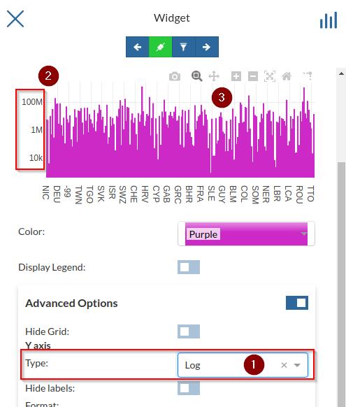
Try changing it to
CATEGORYalso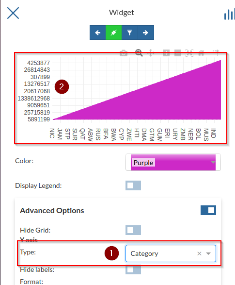
Change it back to
LINEAR, optionally add aPrefixandFormat, check the preview and save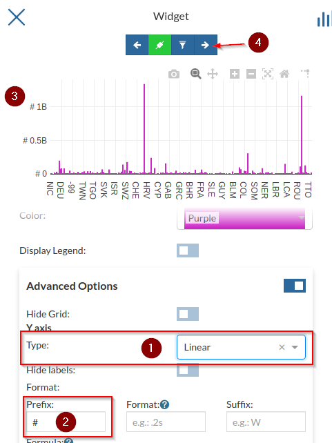
Bind the chart to the map and try zooming on some regions of
Africa; notice the chart adapting accordingly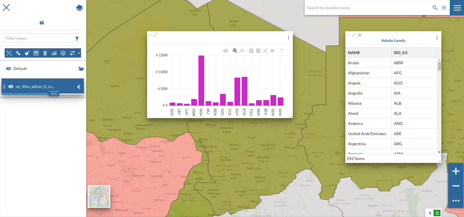
Try zooming around over some other continents and see how the chart changes